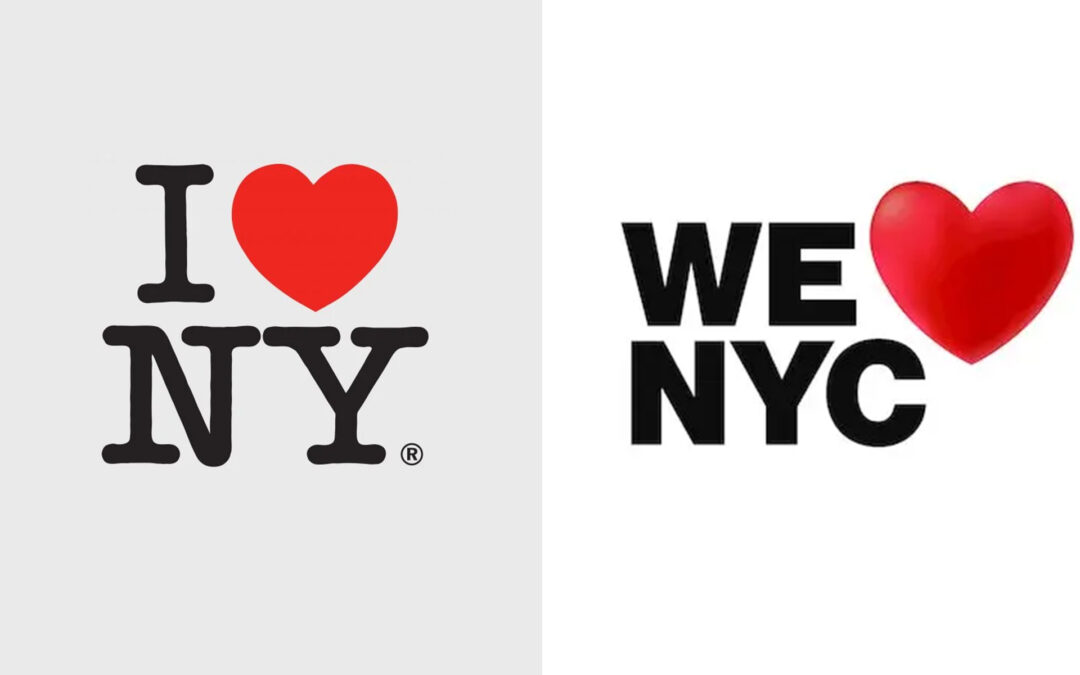
The emblem of “I ❤ NY,” expertly crafted by a graphic designer Milton Glaser in 1977, has recently undergone a significant redesign with a heart-shaped symbol to epitomize the city’s revival post-pandemic. The state of New York commissioned the agency DesignStudio to create a new brand identity for the state. They delivered a logo showcasing New York’s determination to bounce back.
The new design entails a red heart enveloping a small white heart, placed against a black background, accompanied by the phrase “New York State of Opportunity,” inscribed in white. The red heart conveys the love and resilience of New Yorkers, while the white heart symbolizes optimism and aspiration for a brighter tomorrow.
In addition to the novel heart symbol, a new font was created, entitled “NY Sans,” patterned after the typography utilized in the original emblem. A Swiss designer, Fabian Fohrer, crafted the typeface, and it embodies a straightforward, uncluttered style that’s effortlessly readable.
This recent overhaul is part of a larger initiative by the state to boost tourism and economic growth following the coronavirus outbreak.
The rebranded “I ❤ NY” emblem is a well-considered and meaningful modernization of an iconic design. By integrating a new heart symbol and font, the logo captures the city’s recovery post-pandemic and its optimism for a brighter future.


